

An AI Reference Board Is Not a Tattoo Design
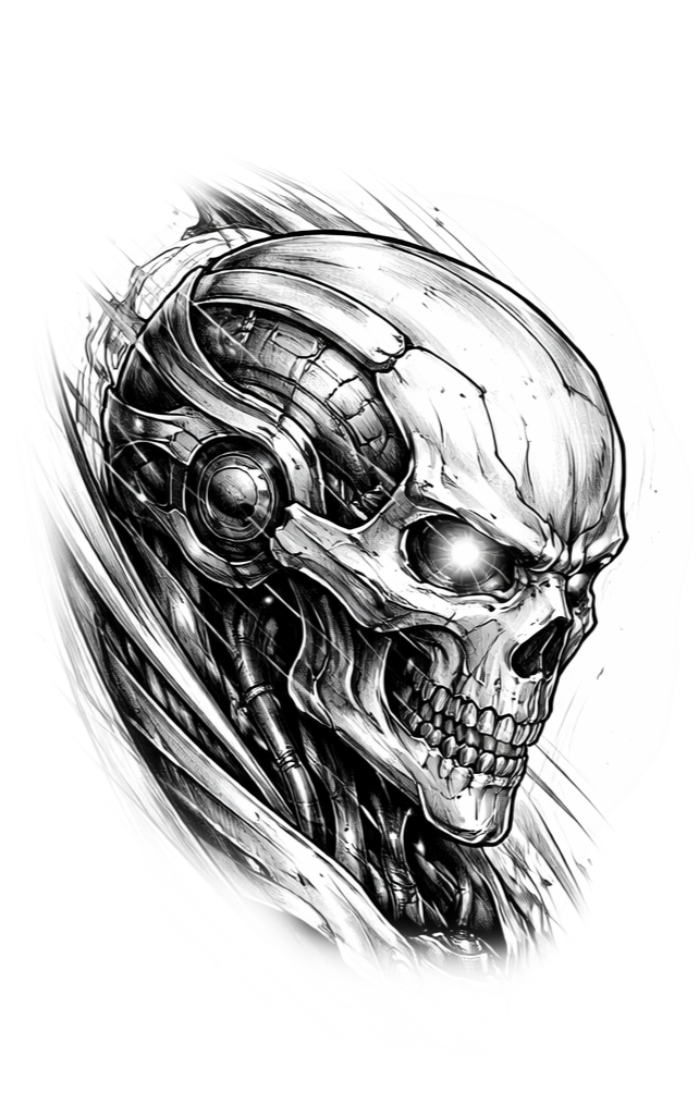
A generated image can sell a vibe while hiding every decision that matters on skin. Turn the mood board into a real plan before you draw.
Pretty is not specific
A client sends a glowing AI image and says, “Like this.” It looks finished, so everybody feels like the hard part is done. It is not. The picture may have impossible lighting, details that turn to fuzz at tattoo scale, anatomy that only works from one angle, and no relationship to the body part where it is going.
Treat it the same way you would treat a stack of Pinterest screenshots: as evidence of taste, not permission to skip the plan.

Interrogate the image
Ask what the client actually loves. Is it the subject, the mood, the color temperature, the movement, the level of detail, or one tiny symbol buried in the background? Clients often point at the whole image when they only mean one part.
Then ask what they do not care about. That question is gold. It separates the emotional hook from the decorative noise and gives you room to make something that belongs on their body.

Turn vibes into tattoo decisions
A usable plan names the placement, size, orientation, focal point, contrast, line approach, color plan, must-have elements, and hard no’s. It also acknowledges what the skin and the artist’s method can reasonably support.
Do not let the generated image make those calls by accident. A soft foggy background may look beautiful on a bright screen and die immediately in the requested two-inch tattoo. A perfectly centered composition may fight the muscle underneath it. Translation is the job.
Keep it practical
What part of the reference matters most?
What can disappear without changing the idea?
What must change for placement and size?
What is approved: the subject, the composition, or both?
Show the gap without insulting the client
You do not need a lecture about pixels or plagiarism. Say: “I can see the direction. Now I need to rebuild it for this placement and for the way I tattoo.” That keeps the client involved without promising a copy.
If the image contains a recognizable living artist’s style, move the conversation toward broader traits instead of imitation. “High contrast with carved negative space” is a direction. “Make it exactly like this artist” is a trap.

The handoff should be boring
At the end, both sides should know what is being designed and what is still flexible. Put that in writing. A short approval summary beats a long argument three days before the appointment.
The best reference board creates momentum. The best plan prevents the momentum from driving straight into a wall.
Make the client choose the tradeoff
When two priorities fight each other, name the fight. A client may want tiny scale and high detail, or a quiet composition and five equally important symbols. Put the choice in plain language: we can keep the size and simplify, or keep the detail and go larger. That is more useful than quietly forcing every request into one crowded image.
Save the agreed tradeoff with the plan. It gives the client real ownership of the decision and gives you something solid to design against. A reference board should start the conversation. The plan is what keeps the conversation from changing every time somebody opens the image again.
Sources and additional reading
This is workflow guidance, not a promise that any particular AI output is safe to copy or use commercially.

Comments